Collaboration: a Confused Story in Five Graphs
My last two posts had graphs about Wikipedia. I tried to avoid drawing conclusions from the data for many reasons, but particularly because the data suffers from a bad streetlight effect.
Here are a few other graphs that do not make the story any clearer.
#Wikipedia web readership
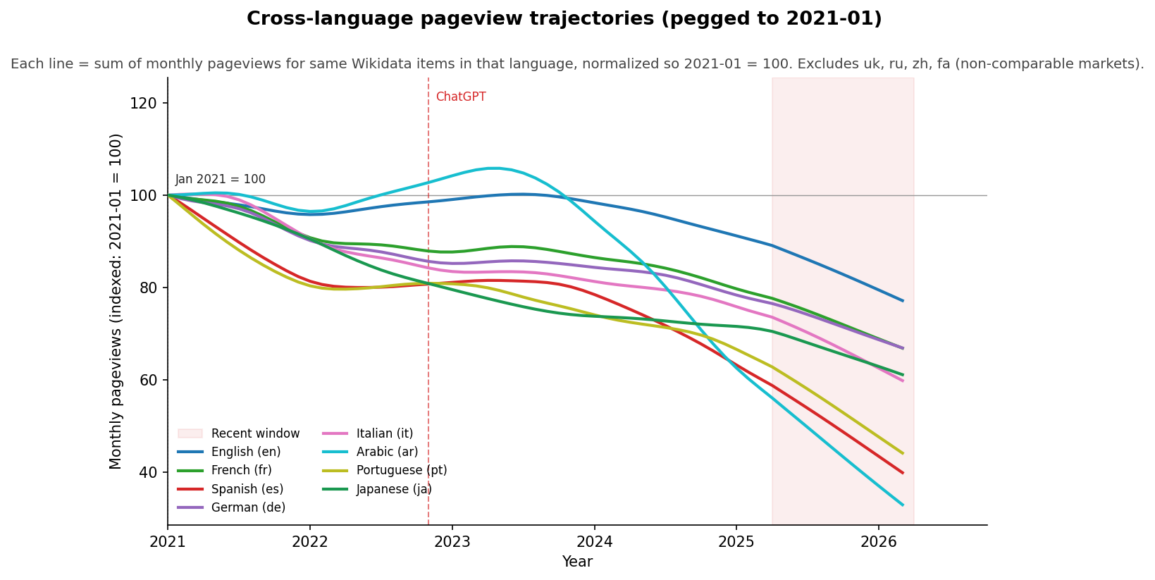
From my previous post.
#US newspaper circulation
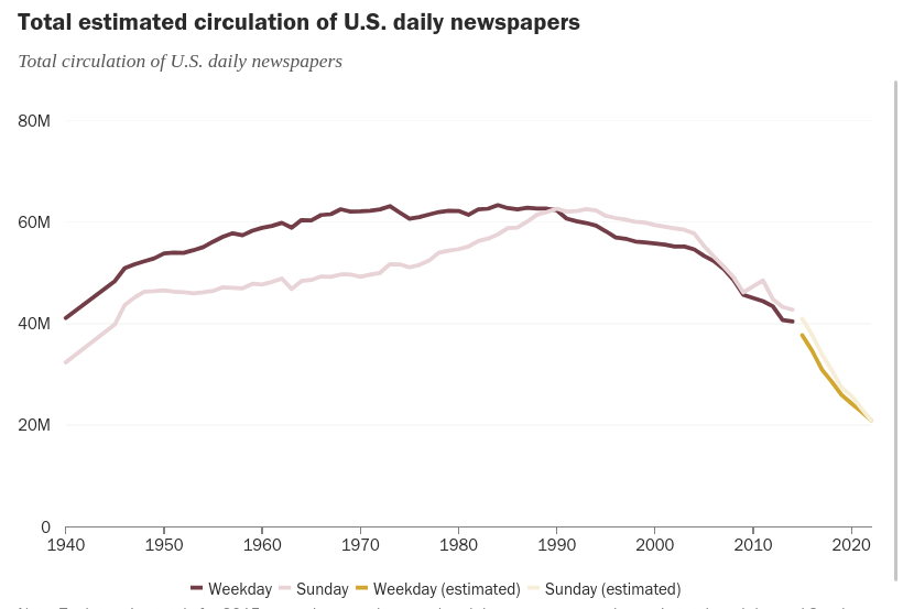
Source: Pew Research Center, Newspapers fact sheet.
#GitHub commits, PRs, and new repos
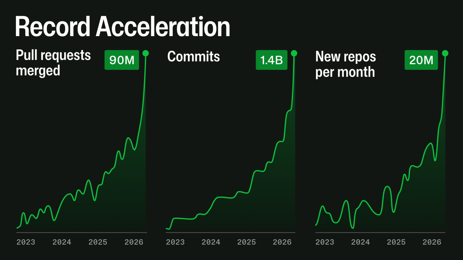
Source: The GitHub Blog.
#arXiv downloads
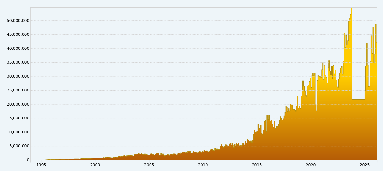
Source: arXiv monthly downloads.
#Reddit users
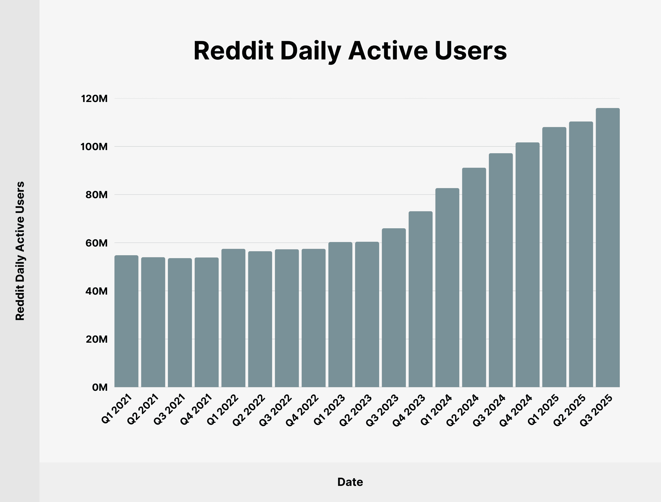
Source: Backlinko, Reddit user and growth stats (compiled from Reddit’s quarterly earnings).
The newspaper graph should be horrifying; things that were once thought to be inevitable never are. I considered adding a “you are here” to the graph, to be honest.
But also there’s still very clearly human itches to learn, to engage, and to create.
Where Wikipedia open knowledge fits into all of those… I don’t know. But there are many stories we can tell and futures we can try to craft.